Visually Stimulating Schemes
Infuse energy into your home with personality-filled palettes and bold fabrics.
Creating spaces that bring joy starts and ends with your design choices. Use conversational fabrics inspired by vibrant destinations. Pair with personality-filled palettes including your favourite colourways. And finally, don’t be afraid to mix bold styles and leave your own personal stamp on your home.
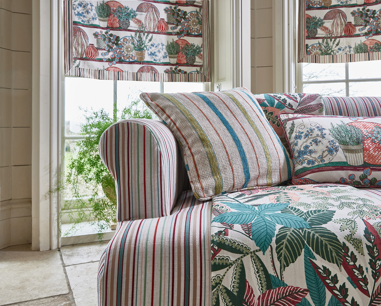
Stitch joy into your décor schemes this Summer, one fabric at a time. Vibrant designs used throughout a room provide an instant uplift as soon as you step into the room, while bright colour palettes leave us feeling inspired and energised. Take a look below at a few ways you can create a visually stimulating space.
Combine Multiple Focal Points Around the Room
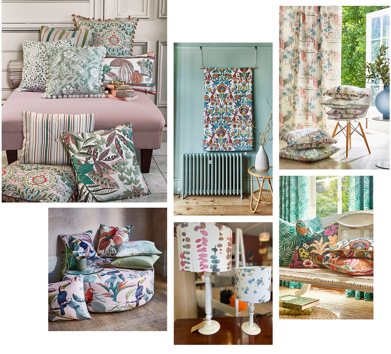
From scatter cushions and footstools to wall hangings and even lampshades, there are multiple opportunities to grab attention throughout your home.
(From Left to Right, Clockwise) Bloomsbury Collection, Maharaja Collection, Palm Springs Collection, Maharaja Collection, Palm Springs Collection & Vintage Collection (Image courtesy of @raspberryleafinteriors on Instagram), Painted Canvas Collection
Start small and swap out smaller soft furnishings such as cushions and throws. Experiment with bold, conversational designs such as pattern-on-pattern florals in shades of fuchsia and teal. Elsewhere in the room, try presenting fabric in unexpected ways such as through a lampshade, or use a piece of leftover fabric to create a wall hanging. Geometrics in rich colourways look striking when hung on your walls, or instead, go for a conversational, henna-inspired print to create a truly stunning focal point.
Create a Palette Clash and Use Contrasting Colourways
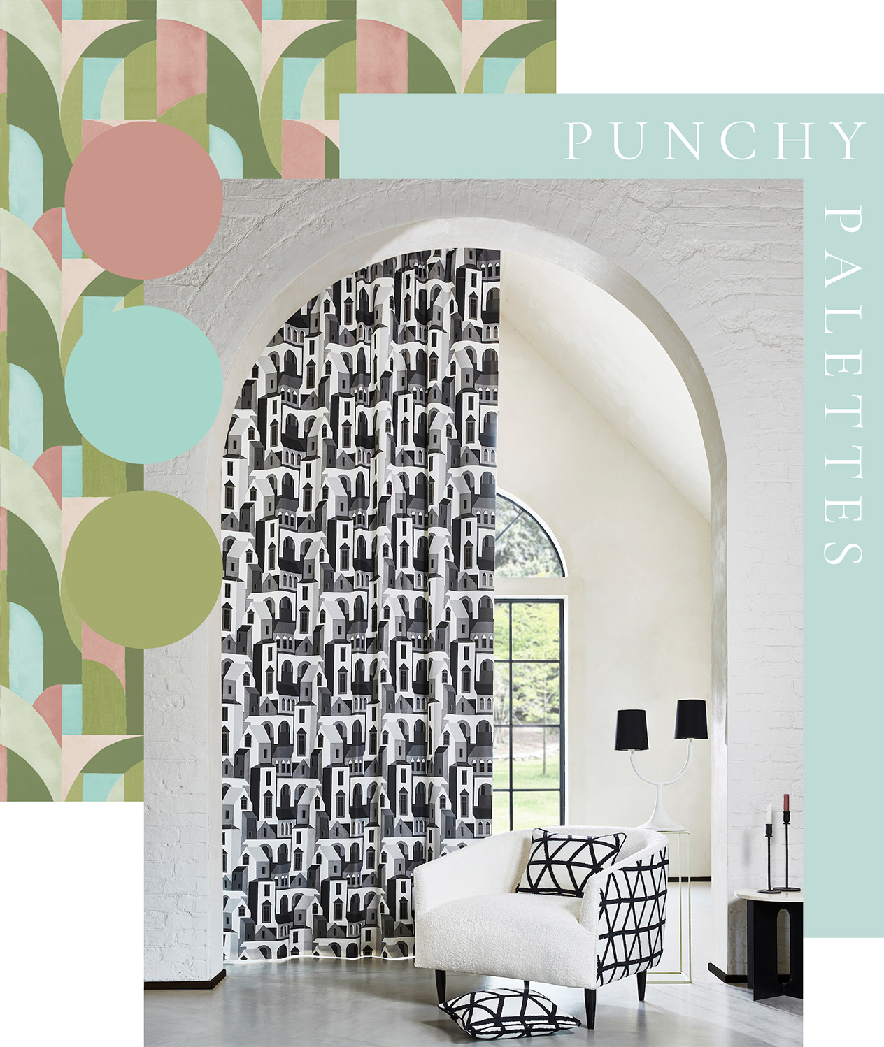
Using two shades opposite each other on the colour wheel, such as pink and green, is guaranteed to create energy and visual interest.
Geometrics look especially impactful when featuring opposing colourways, and a colourful combination we would recommend you try is vibrant pastel pinks and greens. Black and white also looks especially striking when used together, whilst pairing well with more neutral palettes elsewhere in the room. However, if you’re wanting to test the waters with colour clashing, use analogous colourways, shades that sit next to each other on the colour wheel, instead. Blue and green are a good example of this, with the two working together to create characterful schemes.
Use a Mixture of Different Patterns
A blend of different styles presents the unexpected through daring combinations, creating true impact.
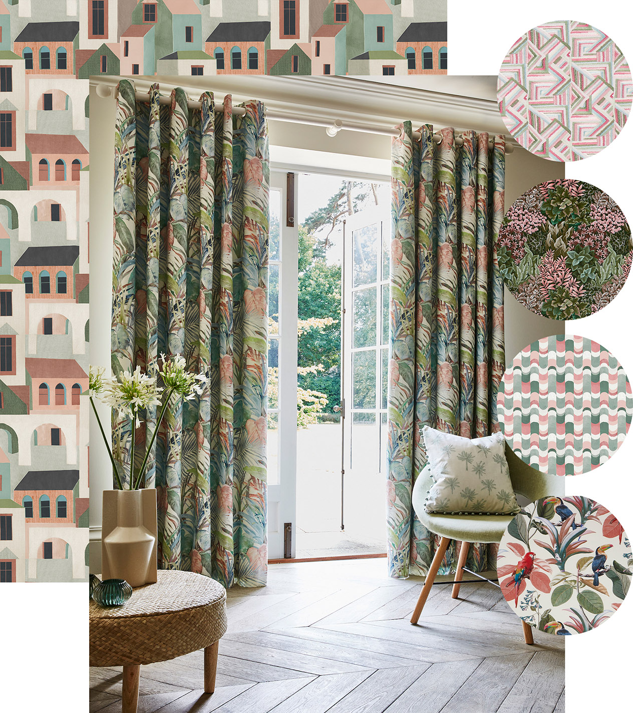
Cuba Collection, Palm Springs Collection, Painted Canvas Collection
One combination we love is geometrics and florals. The more uniform lines of geometrics contrast wonderfully with the free-flowing nature of botanical designs. Get the look by combining scenes of conversational landscapes with large-scale tropical flora. To make more daring fabric combinations work, use a cohesive palette of two or three colourways to prevent your space from becoming too busy.
Pair a Variety of Textures Together for Added Tactility
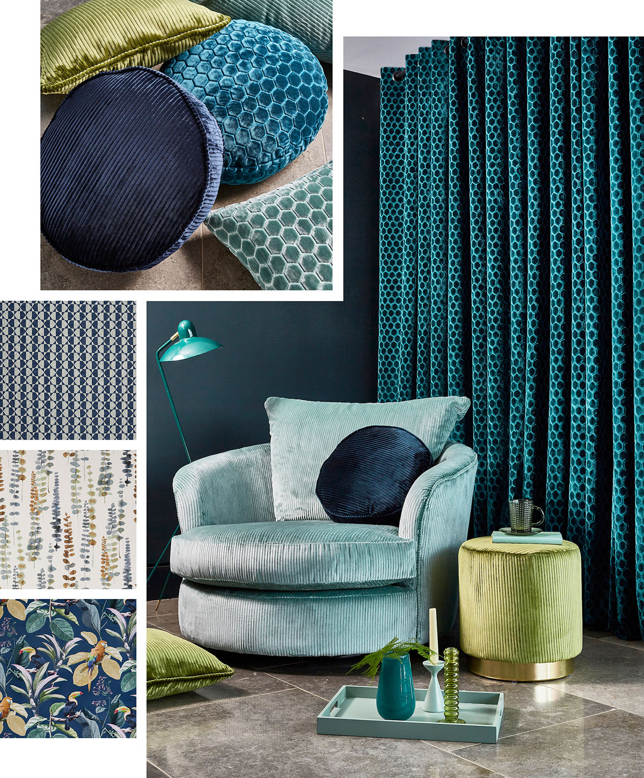
Ensure your space is not only visually stimulating, but also offers plenty of texture for a tactile scheme.
(From Left to Right, Clockwise) Volume Collection, Painted Canvas Collection, Palm Springs Collection, Sierra Collection
Velvet is especially luxurious, and can add an instant pop of drama to a room especially when used in a bold colourway. Consider a cut velvet in a geometric finish or an embossed stripe design to create a multi-dimensional scheme. Vibrant shades such as citrus and turquoise will allow opulent textures to truly pop. We would recommend pairing with cotton prints in varying shades of your chosen palette for a diverse space. Finally, why not add in cosy weaves showcasing geometrics for a diverse mix of styles?
Find your favourite vibrant fabrics and order samples in our product search, or locate your nearest PT stockist
Take a look at our latest Pinterest board for more inspiration

